The brief
The SESAR 3 Joint Undertaking (SESAR 3 JU) is an institutionalised European partnership between private and public sector actors set up to accelerate through research and innovation the delivery of the Digital European Sky. 2021 saw the take-off of the new SESAR 3 JU partnership which will be driving an ambitious programme to make Europe’s aviation infrastructure fit for the digital age. To reflect this high-level aspiration, SESAR 3 JU required a revamped visual identity, putting the emphasis on digitalisation and sustainability.
Our proposal
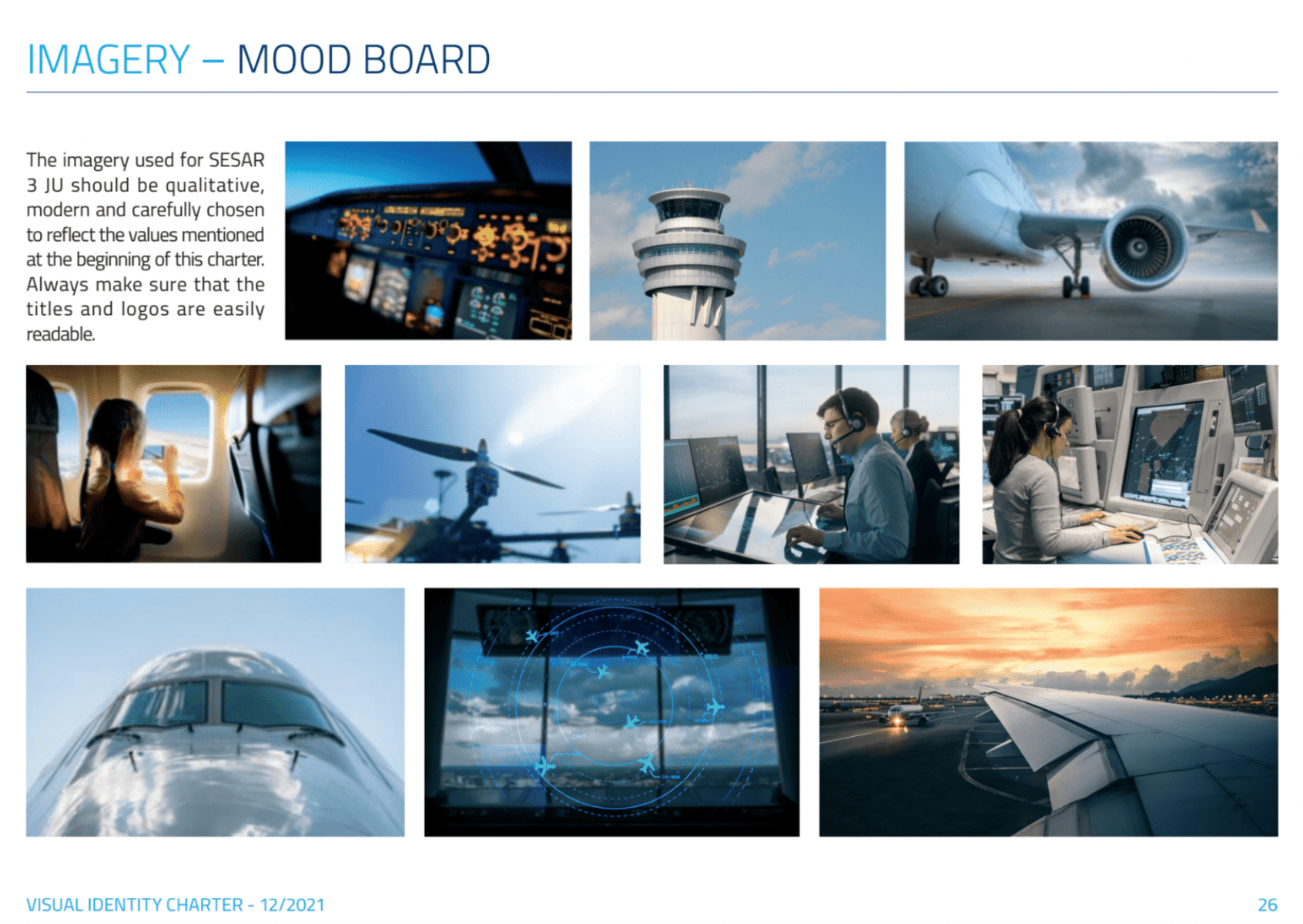
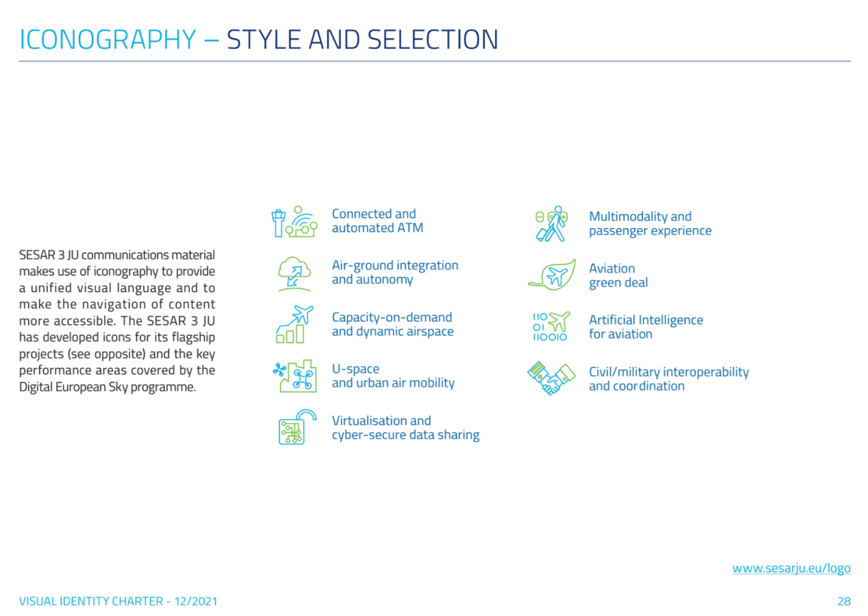
EU-turn successfully piloted the revamp of SESAR 3 JU’s visual identity, using a multi-step methodology. Hand in hand with all the relevant stakeholders, we defined the scope of change and what key values and messages were to be mirrored in the updated visual identity. We provided SESAR 3 JU with a new logo, colour palette, imagery, iconography and typography as well as different templates for internal and external use (PowerPoint, letterhead, social media cards…) We delivered a comprehensive brand manual to ensure an effective application of the visual identity.
We’re proud of
the sleek look of SESAR 3 JU’s visual identity, which will lead to enhanced brand recognition across all media. This rebranding conveys the spirit of the new SESAR partnership: better, bolder and greener.
